Christopher HabetlerIndividualized Data Reports, drawnBack to What I Build

Individualized Data Reports

For academic leaders and principal managers. It turns schoolwide data into individual reports somebody can act on.

One mountain of ninth grade data, two destinies A line drawing. Left of center, a mountain of paper: reams stacked at broken angles with loose sheets wedged in and spilling at the foot, so tall it runs off the top of the frame, with open space to its left. A small chair stands at its base for scale. First, one thin line leaves the base of the pile and wanders far to the right, doubling back on itself, and stops at a blunt dead end with nothing receiving it. Above, along one baseline for the school year, four tall ticks mark the four looks, and the three long gaps between them are drawn as measured spans with their own end marks. Everything to the right of the dead end is empty. Then the wandering line pulls back into the mountain, and as it does it uncovers a faint continuous trace of its whole route that was under it the whole time, which stays, and which recedes further as the new drawing completes. A short straight line cuts through the pile from the same point and out the far side into one small sheet with a tight row grid, the tracker, with a few rows flagged. Four routes of four different shapes leave the tracker at different moments: a long rising curve to a fan of handout sheets, the straight cut continuing to a thick stack of cards, a straight diagonal to a thin stack of cards, and a late descending curve to a single agenda sheet beside a table with seats around it. Each produces an action: a loop that leaves a flagged row on the top handout, touches a class block and returns into the same row; one card pulled clear of the thin stack; one card slid clear of the thick stack with a check mark on it; a short arrow from the table. A light line collects the four, turns a rounded corner and runs back under the year strip into the pile. The spans in the year strip retract, and the four tall ticks retract with them, each uncovering a faint copy of itself that stays. A fine regular comb takes the baseline, one mark for every week, with the four faint tall ticks standing in it. Then, after the drawing is complete, a last beat: beside the fan of handouts, in the open space to its left, a heading and four questions appear one at a time, and from each a short light leader reaches a flagged row on the handouts, three of them newly flagged as the leaders arrive.

8 CSV files a week. Tens of thousands of rows.

About four days a quarter to cut by hand. So nobody did it, and people saw it four times a year.

Four looks a year.

Every Tuesday.

One tracker. Thirty minutes, every Tuesday. The 19 named students are its flagged rows.

Handouts for about 32 teachers

Reports for 19 named students

Reports for about 186 other ninth graders

An agenda for the Wednesday team meeting

What a teacher could suddenly answer

Are my grades genuine representations of student mastery?

Are there assignments that everybody did poorly on that I need to reteach?

Are there assignments where a lot of kids didn’t turn them in?

Are there types of assignments that I just don’t have enough of, or that I have too many of and that are misweighted?

One mountain of ninth grade data, two destinies A line drawing, stacked top to bottom. At the top, a mountain of paper: reams stacked at broken angles with loose sheets wedged in and spilling at the foot, so tall it runs off the top of the frame. A small chair stands at its base for scale. First, one thin line leaves the base of the pile and wanders down the middle of the frame, doubling back on itself, and stops at a blunt dead end with nothing receiving it. Down the right edge, one baseline for the school year carries four tall ticks for the four looks, and the three long gaps between them are drawn as measured spans with their own end marks. Then the wandering line pulls back into the mountain, uncovering a faint continuous trace of its whole route that stays and recedes further as the new drawing completes. A short straight line drops out of the pile from the same point into one small sheet with a tight row grid, the tracker, with a few rows flagged. Four routes of four different shapes leave the tracker at different moments: a descending curve to a fan of handout sheets, the straight drop continuing to a thick stack of cards, a straight diagonal to a thin stack of cards, and a long curve swinging left to a single agenda sheet beside a table with seats around it. Each produces an action: a loop that leaves a flagged row on the top handout, touches a class block and returns into the same row; one card pulled clear of the thin stack; one card slid clear of the thick stack with a check mark on it; a short arrow from the table. A light line collects the four, runs up beside the year strip, turns a rounded corner and enters the pile. The spans in the year strip retract, and the four tall ticks retract with them, each uncovering a faint copy of itself that stays. A fine regular comb takes the baseline, one mark for every week, with the four faint tall ticks standing in it. Then, after the drawing is complete, a last beat: four short light leaders run left out of the fan of handouts from four flagged rows, three of them newly flagged, and the four questions they point to appear one at a time in the list beneath the drawing.
  • 8 CSV files a week. Tens of thousands of rows.

  • About four days a quarter to cut by hand. So nobody did it, and people saw it four times a year.

    One tracker. Thirty minutes, every Tuesday. The 19 named students are its flagged rows.

  • Four looks a year.

    Every Tuesday.

  • Handouts for about 32 teachers

  • Reports for 19 named students

  • Reports for about 186 other ninth graders

  • An agenda for the Wednesday team meeting

  • What a teacher could suddenly answer

  • Are my grades genuine representations of student mastery?

    Are there assignments that everybody did poorly on that I need to reteach?

    Are there assignments where a lot of kids didn’t turn them in?

    Are there types of assignments that I just don’t have enough of, or that I have too many of and that are misweighted?

Individualized Data Reports. The same mountain of data, twice. The new way cuts straight through it into one tracker and reaches the exact right people every Tuesday.

One export, four reports

The same Tuesday morning, from the file landing to somebody picking up the phone. Every student, teacher, campus and number below is invented.

  1. Step 01

    What you start with

    One export out of the student information system. Every graded assignment, for every student, one per row. Thirty-eight columns of codes, and nothing in it is a next step.

    What used to be a mountain of data is now something somebody can act on. This is the mountain.
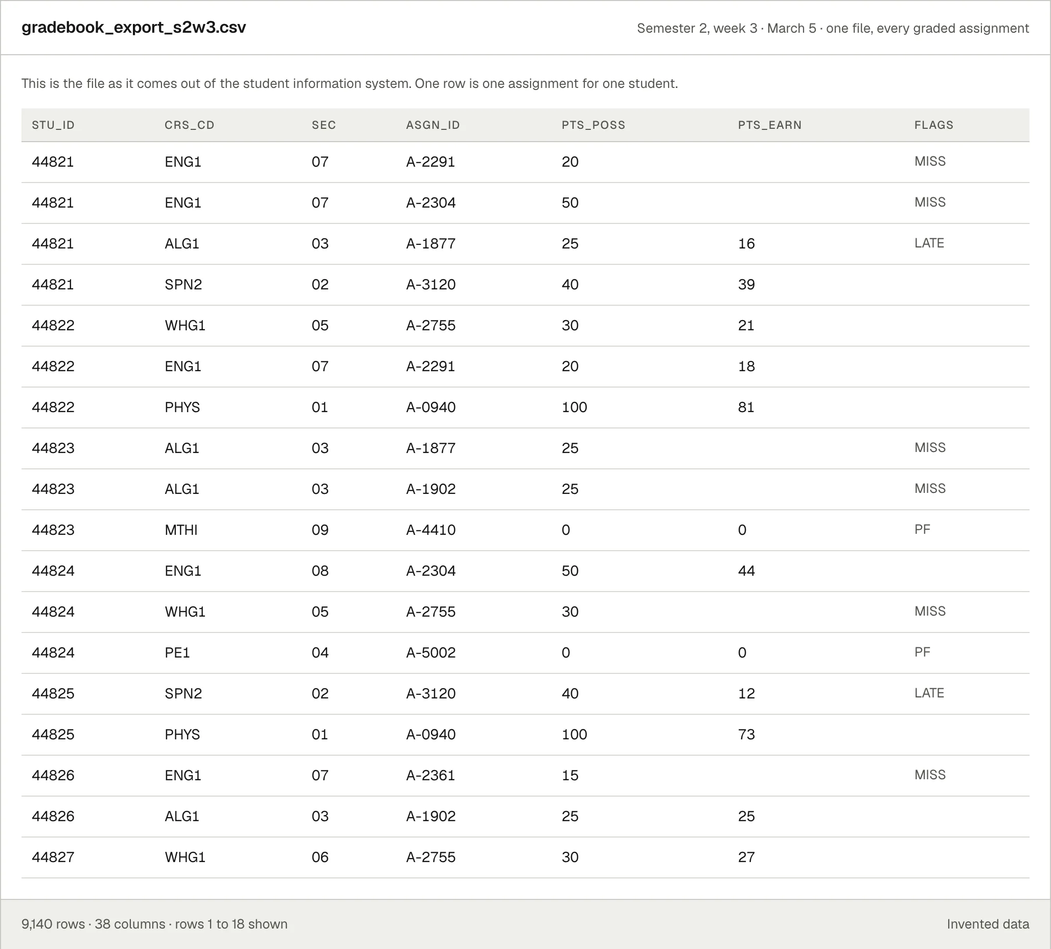
    An invented gradebook export open as a spreadsheet. Columns of codes: student id, course code, section, assignment id, points possible, points earned, and a flag column reading MISS or LATE. Eighteen of nine thousand one hundred and forty rows are visible, and none of them says what to do.
  2. Step 02

    What you ask for

    I take a screenshot of the original data, bring it over, and tell it to run the weekly reports. Same instruction every week, same rows as last week, so the change is the thing you see.

    Never student records. A script that is not AI turns every child’s name into a code first, and the coded version is what gets read. It has no idea what the codes mean. The names come back on your side, after the reports are built.
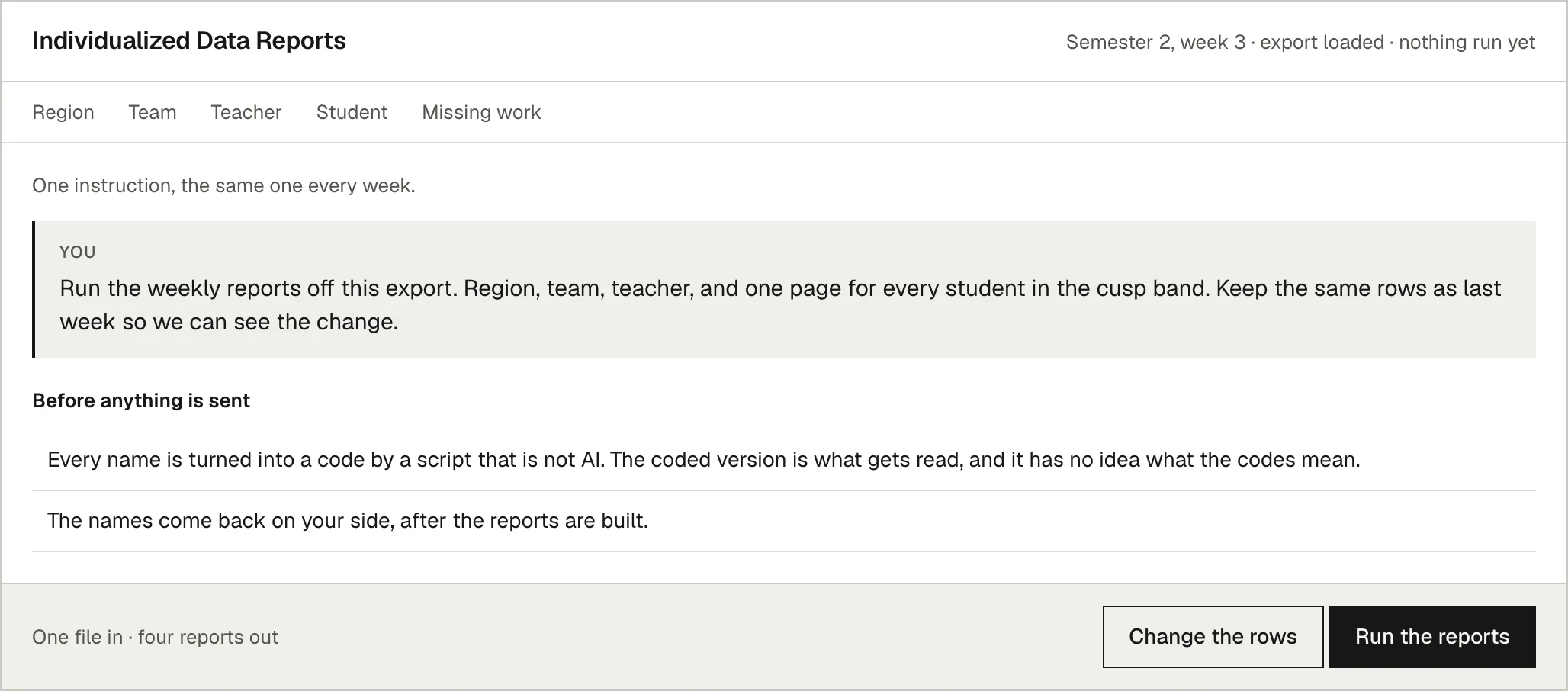
    The reports tool with nothing run yet. One typed instruction sits in a box: run the weekly reports off this export, region, team, teacher, and one page for every student in the cusp band, keeping the same rows as last week. Under it, two lines describe the step that replaces every name with a code before anything is read.
  3. Step 03

    Report 1, the region

    Five campuses, nineteen students on the edge, one campus to call today. The region page exists to point at the one place worth a phone call, not to rank anybody.
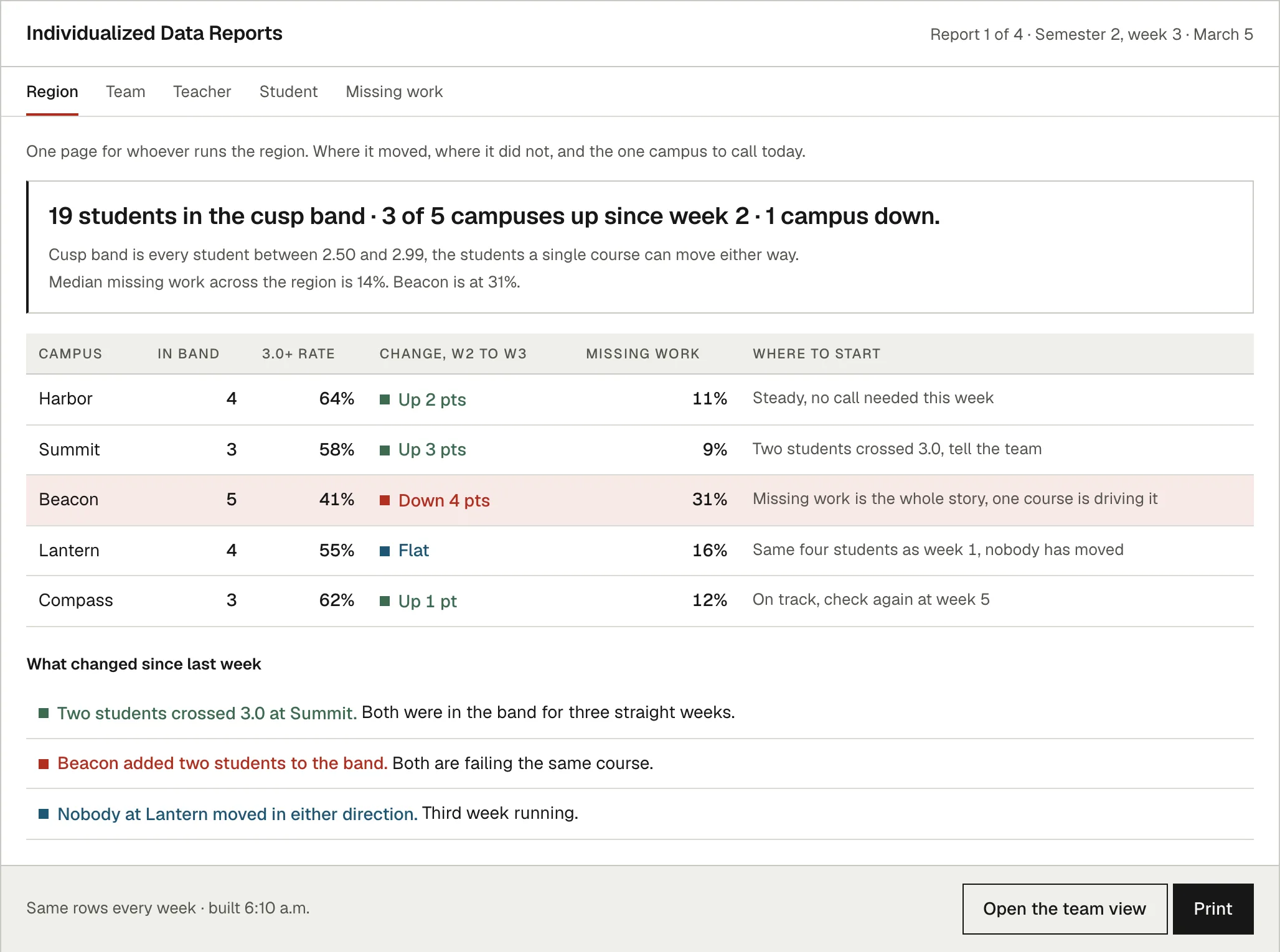
    Report one of four, the region view. A headline reads nineteen students in the cusp band, three of five campuses up since week two, one down. A table lists five invented campuses with how many students are in the band, the rate above a three point zero, the change since last week and the missing work rate, with one campus flagged red. Below it, three lines naming what changed since last week.
  4. Step 04

    Report 2, the team

    The same numbers cut for the grade team, down to the students they actually share. This is the page they bring to the Thursday meeting.
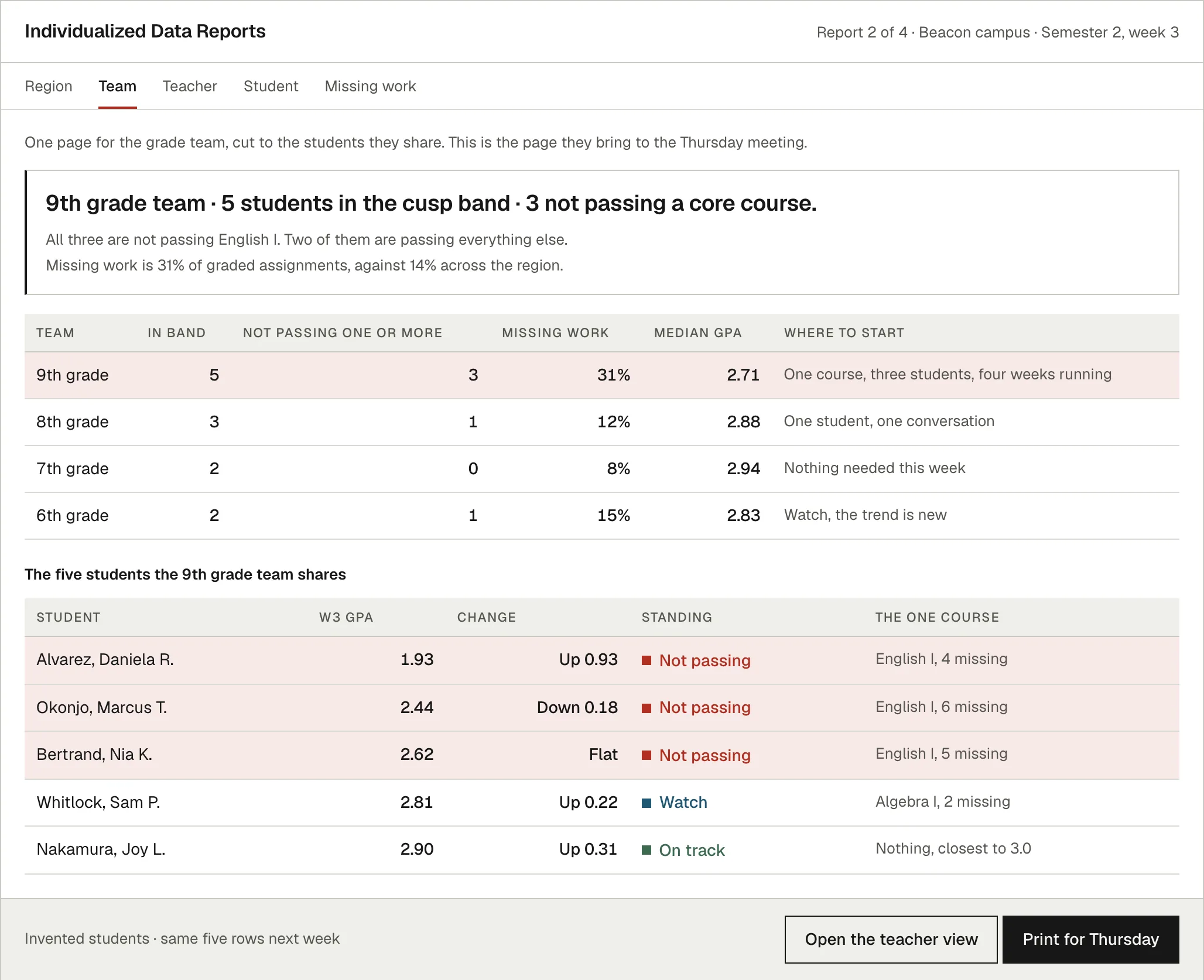
    Report two of four, the team view for an invented campus. A headline reads five students in the cusp band and three not passing a core course, all three in the same subject. A table compares the four grade teams, and a second table names the five students that team shares, with each one’s grade point average, the change since last week, their standing and the single course that is driving it.
  5. Step 05

    Report 3, the teacher

    Cut again for one teacher, and written for a coaching conversation rather than an evaluation. It names the pattern before it names a student, because in this case two assignments explain most of the problem.
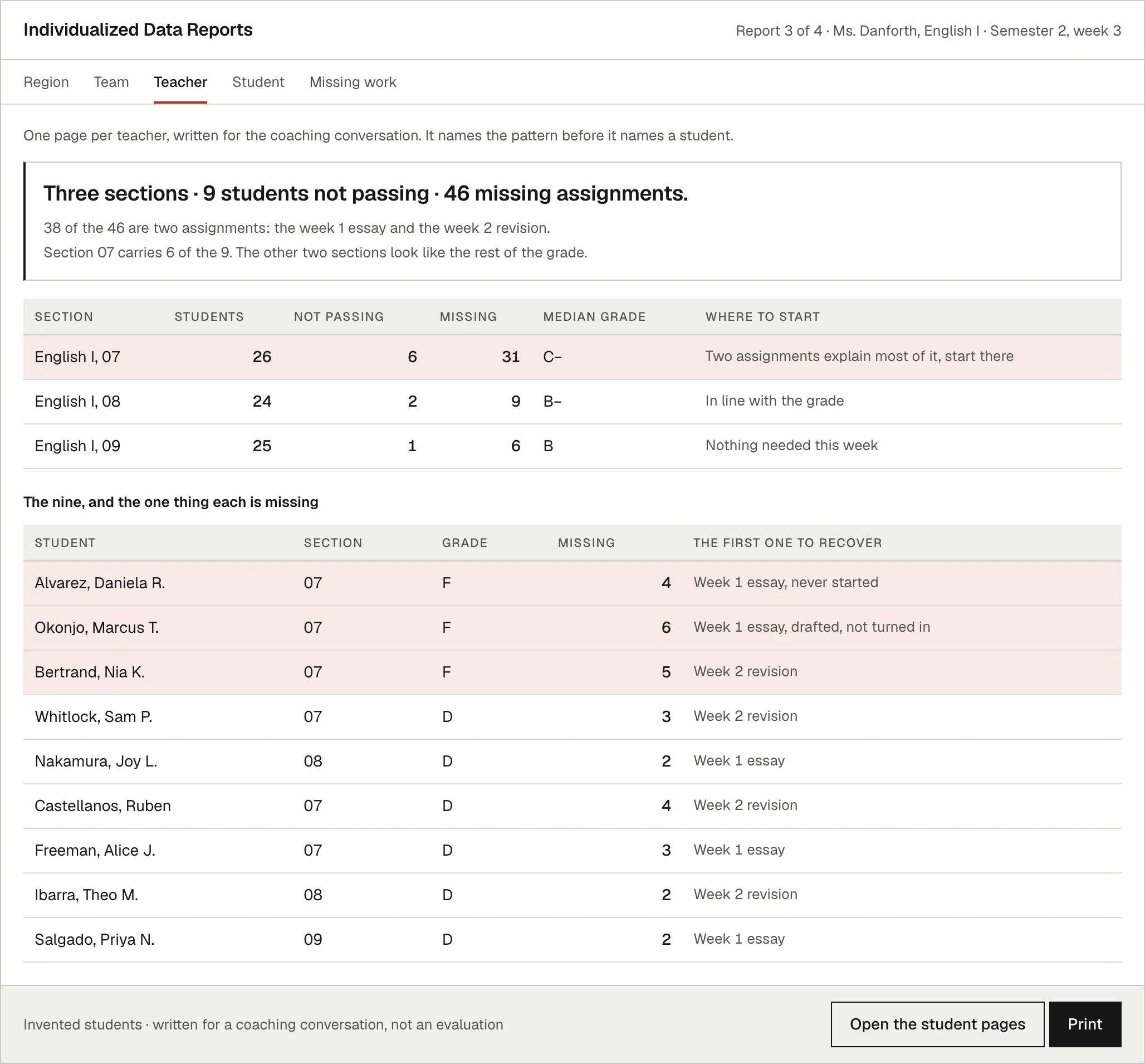
    Report three of four, the teacher view for an invented English teacher. A headline reads three sections, nine students not passing and forty-six missing assignments, with a line noting that thirty-eight of the forty-six are the same two assignments. One section is flagged red in the table of three. A second table names the nine students, their grade, how many assignments they are missing and the first one to recover.
  6. Step 06

    Report 4, the student

    One page per student, written to the student. Same rows as the regional memo, cut for the person whose grade it is. The gap to the target is on the page, and so are the three moves that close it.
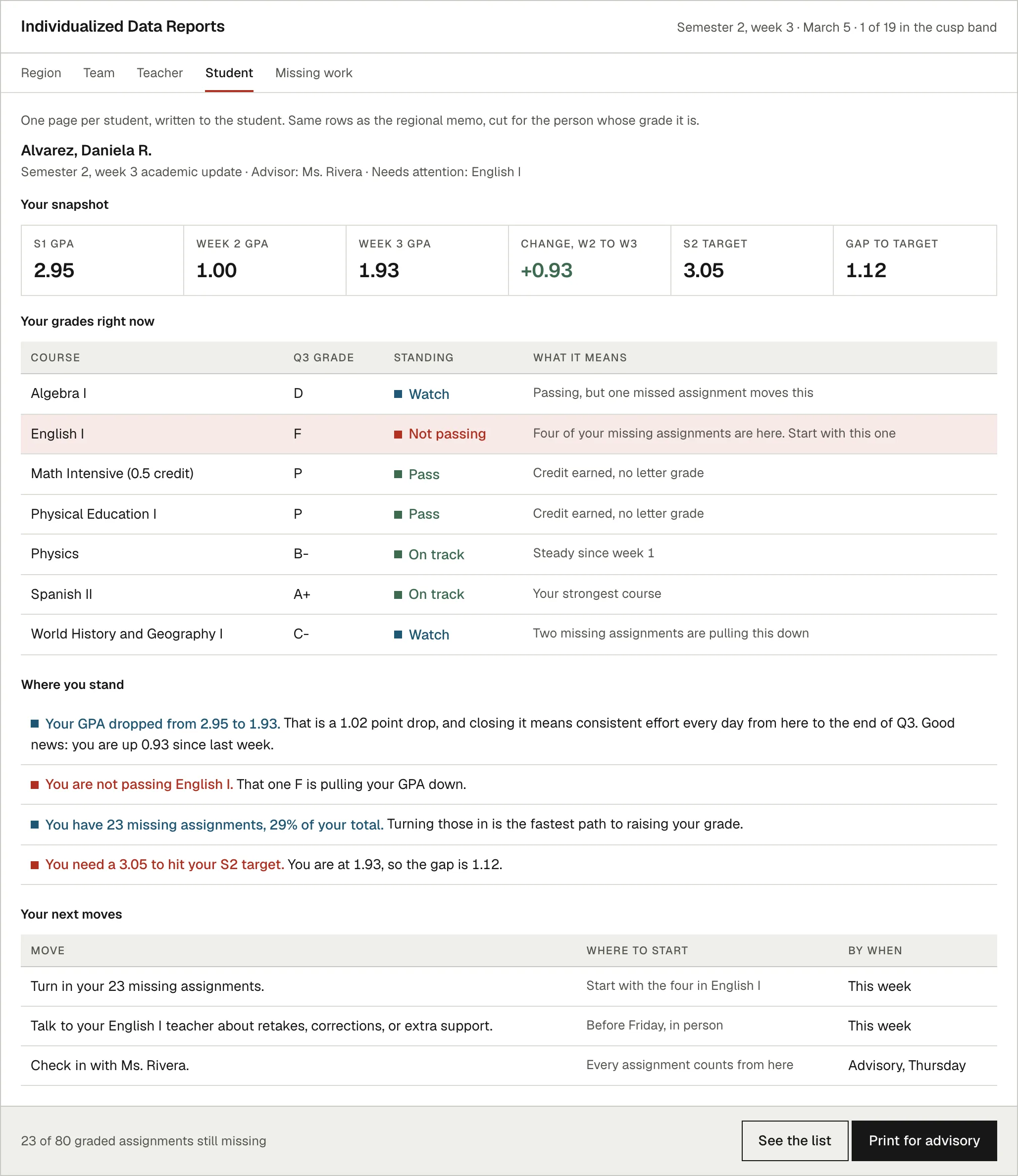
    A student report in the suite look. A snapshot strip shows the semester one GPA, this week’s GPA, the change since last week and the gap to target. A grades table lists every course, with the failing course flagged in red. Below it, where the student stands and three next moves with a date on each.
  7. Step 07

    What a person decides

    The tool proposes who talks to whom and by when. A person changes what they want changed, and one row it will not fill in at all, because the student with the most missing work has an advisor who is out the rest of the week.

    That is the whole design. It does the sorting. It hands back the calls.
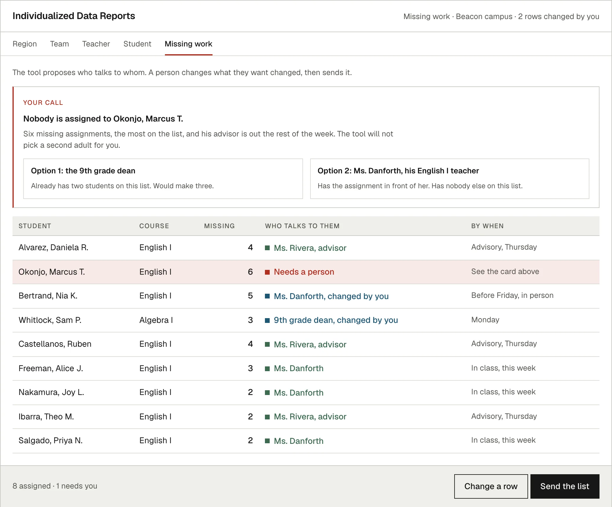
    The call list from the reports tool. A red card says nobody is assigned to one invented student and lays out two options for who should take him, with no recommendation. Below it a table of nine students names who talks to each one and by when, with two rows marked changed by you and one marked as needing a person.

How long it takes

The export arrives, the instruction is one line, and the four reports come back with the same rows they had last week. Nobody retypes a number, nobody builds a new spreadsheet to answer a question they already answered, and nobody waits on the one person who knows the formulas.

The time that’s left is the part that was always the job: reading the page and deciding who to go see.

This is the work. If you have an export nobody reads, that’s a thirty minute conversation.

Book a 30 minute call (opens in a new tab)Or write me at chris@habetlerconsulting.com.